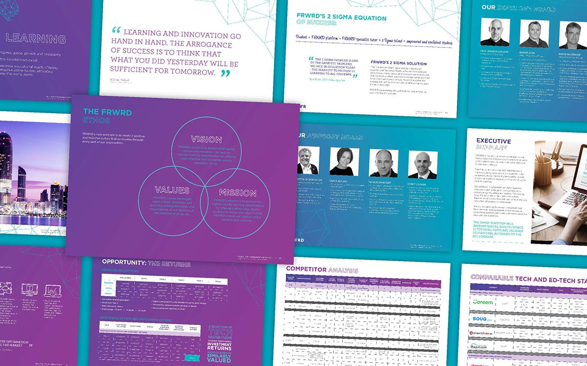
Sales presentations have the power to inspire your audience.
Unfortunately, it’s not just what you say, but how you say it that matters.
A good presentation can’t just sound good, it needs the perfect blend of design, structure, and copy to transform a lead into a sale.
More than just a strategy for motivating sales, the right sales presentation design is a chance to demonstrate your knowledge in an industry and create a sense of trust. Your narrative convinces your customers that you understand their needs and have what it takes to fix their problems.
The right slides could be the key generating a community of dedicated customers. Design them correctly, and your presentation slides will:
- Inform: Give your customers valuable information about your offer
- Instruct: Educate your audience with easy-to-follow insights
- Entertain: Capture a group’s imagination and inspire creative thought
- Motivate: Get people excited about your chosen topic
- Activate: Drive people to act on their analysis and feelings
- Persuade: Appeal to the logic, emotions, and preferences of your customer
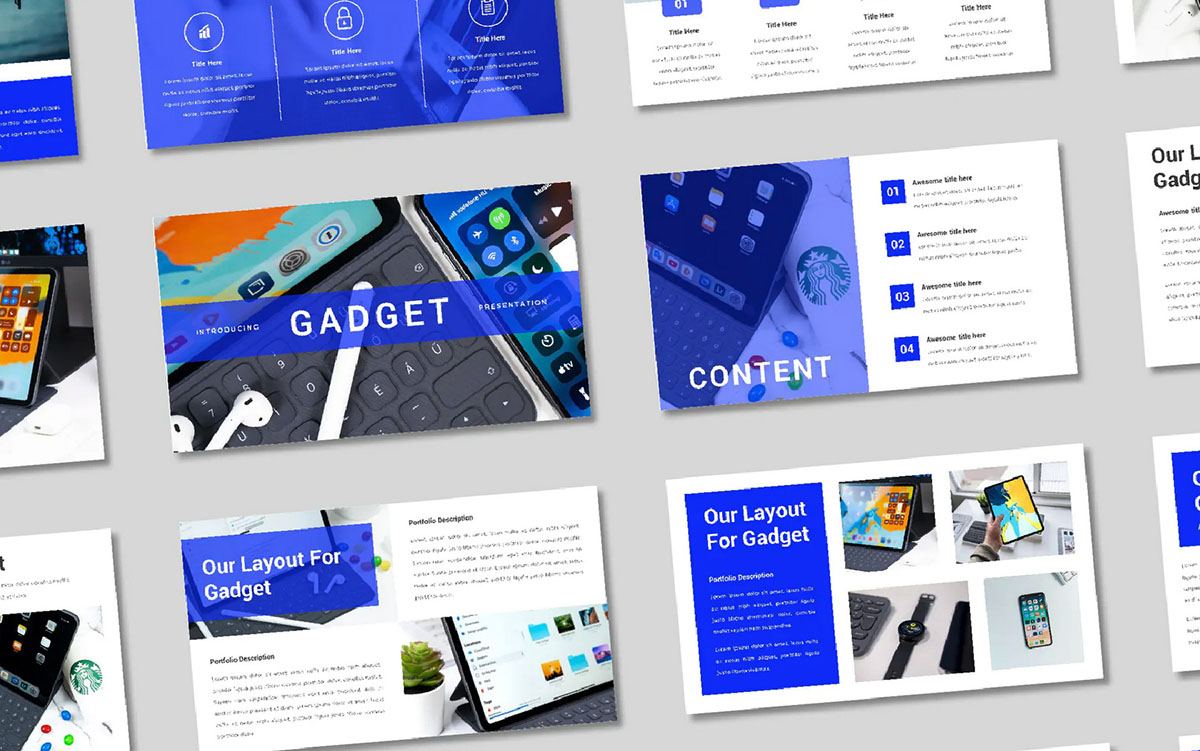
7 Essential Slides For Your Sales Presentation Design
Sales presentations are slides and content you use to increase your chances of a sale. While converting customers can be challenging, studies show that 91% of presenters feel more comfortable when presenting a fantastic slide deck.
So, what makes for a stunning sales presentation? Every proposal is different, but many do include the following elements:
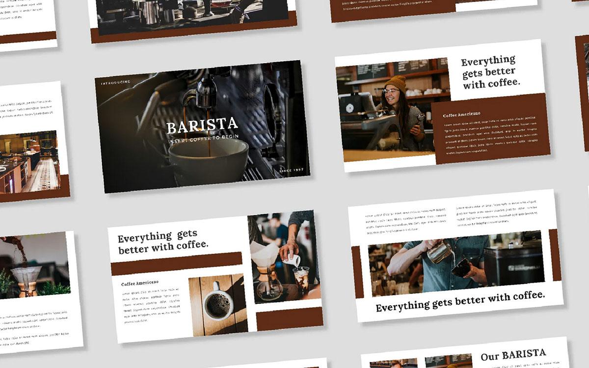
1. An Eye-Catching Cover Slide
The cover slide is the first thing that attracts your audience attention. A professional presentation design service will focus on conveying the value of your presentation in this initial page. Through the use of bold action words, benefit-driven copy, and branded graphics, you can make a first impression that holds onto your customer’s attention for the duration of your event. Cover slides are:
- Bold and eye-catching: Colors, images and even moving graphics are common on cover slides. Don’t be afraid to experiment with visual content.
- Informative: Cover slides tell your audience what the presentation is about, without giving too much away.
- Intriguing: Your cover slide will include just enough insight into what you’re going to cover to get your audience excited.
2. A Narrative
A good presentation isn’t just a list of information, it’s a story. HubSpot says the most successful assets are 65% story-driven. Storytelling is a natural concept for us humans, and something we’ve been doing for century.
We’re more inclined to remember emotional, engaging stories we can relate to.
Start your presentation by building context. Describe what led you to this moment, and why it’s so important to share this information with your audience. Talk about how these insights will benefit your customers and connect the data to your brand values.
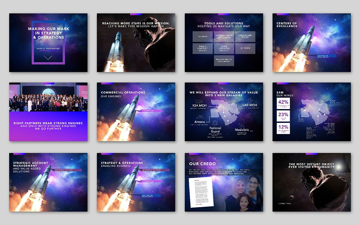
3. Customer-Focused Content
It’s easy to get caught up boasting about the latest accomplishments of your business – but this presentation isn’t about you. When you’re working on your sales presentation design, ask yourself how each slide captures a pain point for your customers, and explains what you can do to fix it. Focus on the unique benefits you can bring to your audience.
A presentation design agency will help you to outline content which shows your understanding of the issues your customers currently face. You can address the reasons that the problem constantly goes unsolved and discuss the shortcomings of existing solutions. Don’t badmouth your competition but give their solutions as a comparison point to your own.
4. Information About Your Solution
After addressing the problems your customers face, and the shortcomings of competitor tools, step in and introduce how your option is better. Talk about the kind of benefits your product or service can offer which customers can’t get elsewhere.
If your clients are looking for accounting software which connects multiple streams of income from different accounts, but previous tools haven’t been good at syncing data, show how your solution simplifies this process.
Your introduction to your product or service should immediately demonstrate how it fixes the biggest problem your customers currently have.
5. Insights Into The Benefits Of Working With You
After you show your customers your solution, let them know why they should be buying it specifically from you. Customers fall in love with the values and people behind a business – not the specific service or product.
Your value proposition might be the super-simple and easy-to-use software you’ve created, but what else makes you special outside of that? Can you offer fantastic service, so your customers have all the help they need to take advantage of your solution?
List all of the things that might impress your audience, from your incredible customer support team to your state-of-the-art technology.
6. Examples And Social Proof
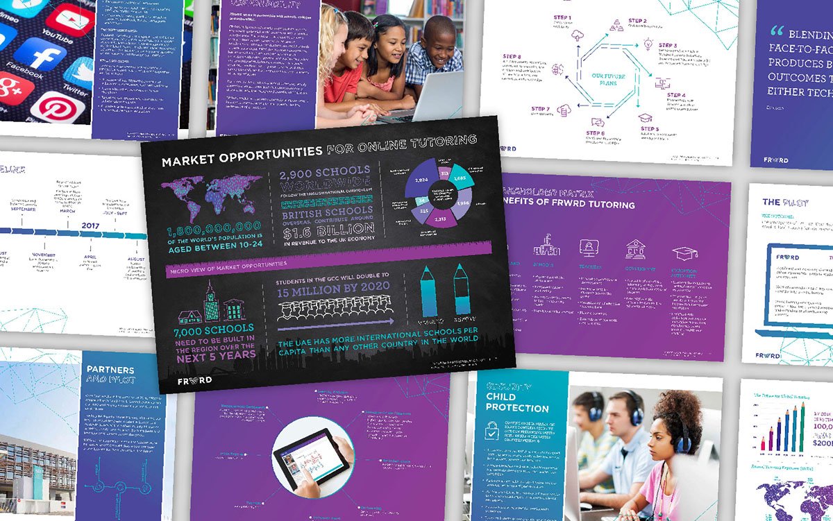
During the presentation, you’re actively working on building a relationship between yourself and your prospects. One of the best ways to ad trust to your sales presentation design, is just to show your potential customers how amazing you’ve been in the past.
If you have case studies, reviews, and testimonials from previous customers, now’s the time to show them off. Tell stories about the problems these previous customers faced, and how you helped them overcome those issues. If you have a physical product, you can show off the features via slides when discussing previous use cases.
One particularly great way to grab audience attention in a presentation is to add video presentations. Real video testimonials from customers make a huge impact.
7. The Conclusion
Finish your benefit-focused presentation with a summary of all the points you’ve covered, including a clear call to action. This is the part where you tell your audience what they need to do next if they want to leverage all the benefits you just showed.
Just as you designed your cover page to have an immediate impact on your audience, your last page should be eye-catching, powerful, and simple too. Have a single, clear message (don’t confuse your audience with lots of text), and an instruction on what to do next.
Following the call to action, you can also ask your attendees or prospects whether they have any questions. Any feedback given at this point could help you to improve the impact of your presentations going forward.
6 Features Of An Outstanding Presentation Deck
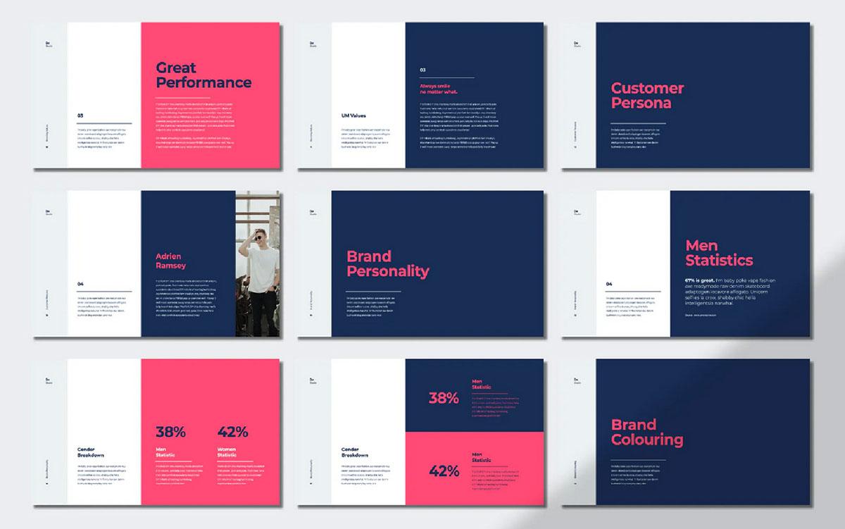
Knowing the pages to include in a sales presentation design is just the first step. Once you have your narrative laid out, it’s time to start implementing the details that will have the biggest impact on your audience, from professional photos to amazing graphs and charts. The best presentation decks include:
1. Plenty Of Visual Content
People don’t want to spend hours squinting at a presentation screen to read paragraphs of text. Though a little written information may be necessary, “full sentences of text” are among the top three frustrating features in any presentation for audiences.
Replace complex paragraphs with inspiring graphics and visual content. Rather than writing all about the results you achieved for a previous customer with your new software, create a page showing their progress on a specific metric over a certain time. This chart acts as an instant source of visual information, while you add to the context with spoken information.
Visuals are far more likely to keep your customer’s attention. Reducing text on your slides also encourages you to talk more. Your speech and the words you use help your audience to build a relationship with you. Around 84.3% of top presenters recommend highly visual designs.
2. Invest In Professional Photos
There are various forms of visual content you can include in a presentation. Graphs and charts are ideal for making information more digestible, while graphics and animations can add context to a topic. If you’re going to be showcasing photographs, make sure they’re professional.
Leveraging the benefits of a presentation design agency for your proposal works best when you give that agency access to the right assets. Stock photos that customers have seen dozens of times before aren’t going to have an impressive result. Genuine photos of real people from your team are authentic and engaging.
Invest in creating images unique to your brand, whether its illustrations drawn in your chosen colors or photos of your team.
3. Sensational Storytelling
Every presentation must have a narrative to guide your customers or viewers from the start to the finish. Planning your narrative and how you’re going to tell it is crucial. According to Shakespeare, the best stories follow a three-act structure:
- Act 1: Start with an attention-grabbing introduction. Introduce your brand, the topics you’re going to cover, and why this presentation is so valuable. Hook your audience with bold statements and insights, so they want to keep listening.
- Act 2: Discuss the problems and conflicts your audience faces. What kind of issues are they having, and why do the current solutions available not solve them?
- Act 3: Resolve the problem by introducing your products and services. Show what’s possible with your solution and highlight your differentiators. Use case studies and testimonials to prove your offering is the best.
When you finish your presentation, make it memorable, like the end of a good story. Recap what you’ve covered briefly if necessary and allow attendees to ask questions.
4. Consistent Design Elements
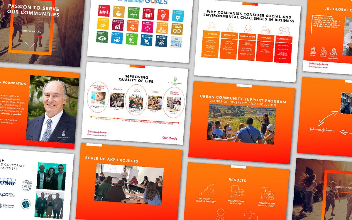
Sales presentation design is just like designing a new marketing or social campaign. Every presentation you produce needs to highlight the defining features of your brand. Before you approach an agency to help with your sales decks, make sure you have a brand guidelines document available.
Your brand guidelines will cover all the things agencies need to know about your brand, from your values and mission statement to the kind of typography, colors, and imagery you prefer to use. You can also provide design professionals with user personas, so they understand the kind of customer you’re trying to reach too. This can help with making tailored decisions that appeal to your audience.
Whenever you add something new to your slides, or update your presentation kit, refer to your brand guidelines and make sure you’re being consistent. Consistency is crucial to building a sense of familiarity with anyone who sees your assets. The following things should always be the same:
- Brand logo
- Tone of voice
- Brand colors
- Fonts and typography choices
- Types of imagery
5. Usage Consideration
These days, we don’t only deliver presentations in person. If you’re showcasing your new product or pitching to an audience member offline, you can structure things differently to what you might do online.
In person, you might use notes placed in front of you as you talk to help you follow along with the slides. If you’re sending information over email, you need to ensure all the slides include enough information without your voice accompanying them. You could always create a video of yourself presenting the deck if you think your input is crucial.
When making a presentation through video conference or webinar, think about how you can connect with your audience. Keeping your notes in a place where you can see them easily will stop you from constantly glancing away from the screen.
6. A Strong Call to Action
We mentioned above that the conclusion of your slide deck should be just as engaging and memorable as the introduction. When you reach the end of your presentation, think about how you’re going to impress or dazzle your audience. Could you make a joke to get people laughing and make them feel more comfortable about coming to talk to you?
If you’re trying to convey a sophisticated, credible brand personality, could you finish on a powerful statement, like “Come and learn how we can improve your sales by 50%”.
Every conclusion should include a strong and clear call to action. You’ve covered everything your customer needs to know to make this purchase. Now tell them what they need to do next. If you’re sending a presentation online, you can include contact details, social media titles, and hyperlinked URLs to guide customers on their next step.
If you’re presenting your sales deck in person, give people various opportunities to get in touch with you. You can show links to your website, social pages, and phone number on the last slide for people who don’t want to approach you directly after the conference.
4 Quick And Crucial Slide Design Principles
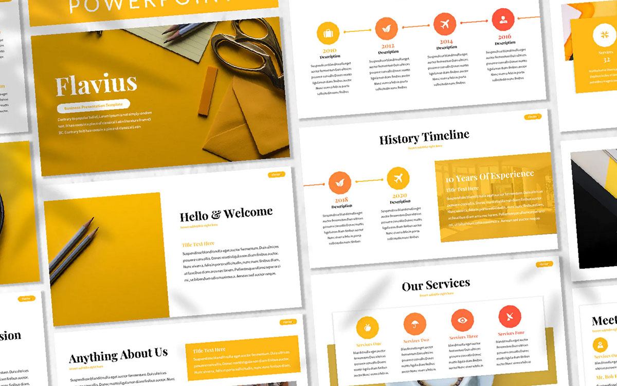
The more presentations you produce, the more you get an idea for your customer’s preferences and what they respond best to. Whether you’re presenting online or offline, keeping a close eye on your audience’s response is crucial.
During the early stages of your sales presentation design process, when you’re still getting to know your audience, stick to the following principles:
Keep It Simple
Simplicity is key for any presentation.
One of the most common mistakes that companies make in presentations is including too much information on each slide. The aim should be to deliver valuable information to your audience fast, without repeating yourself, or waffling for too long.
Each slide needs one main point, explained by the title or headline. The content you include should be mostly visual, with a few words here and there to guide your speech if necessary. Anything that doesn’t deliver value to your audience shouldn’t be there. Go through your presentation and audit for unnecessary content before you publish it.
Put User Experience First
If your customers are going to be going through your slides on their own, make sure it’s easy to swipe or click from one page to the next. Don’t overwhelm the slides with too many complicated animations and features your clients won’t know how to use.
User experience is important when presenting in person too. The person accompanying your slideshow needs to skip smoothly from one part of the story to the next. Any confusion on how to use your software can come across as clumsy and unprofessional.
Make It Beautiful To Look At
A great presentation is clean, easy to follow and brimming with visual context.
The world today is filled with examples of high-quality professional-level design. Addressing your audience with a presentation that looks homemade isn’t going to leave the right impression. You need genuine, authentic photography, stunning templates, and easy-to-read graphs.
Make visual data as clear as possible in the form of charts and illustrations. Don’t cram every slide with too much information. Plenty of white space will be easier on your viewers’ eyes. Use your professional presentation design service for help showcasing your brand image through every slide.
Be Memorable
A great presentation stays with your audience.
After the slides are finished rolling, your customers should remember what the key points were and why they were important. Beautiful visual elements, statistics, and facts are great for grabbing customer attention.
A little repetition can help make your message memorable. You might mention why your offering is so valuable a few times. Just don’t’ fall into the trap of saying the same thing over and over, or your customers will get bored.
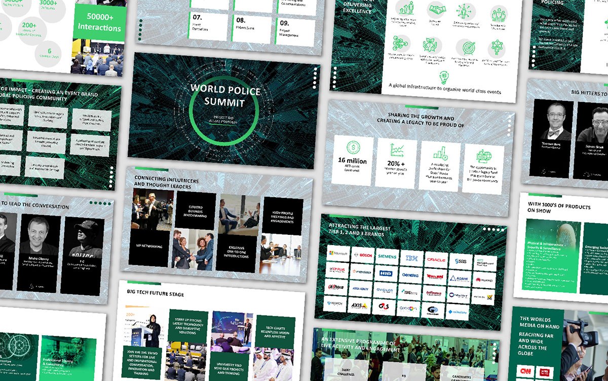
Transform Your Presentations
Sales presentations are a valuable tool for pitching your company’s benefits to your target audience. But too many business leaders rush through the presentation design process, leading to clunky, unattractive slideshows that can’t hold viewer attention.
Working with a presentation design agency ensures that every page of your sales deck is optimized to connect with your audience, build relationships and inspire action.


