Talk to any branding expert, and they’ll tell you there’s more to a brand than a fancy logo.
However, it’s your visual assets that make the biggest impact when establishing a new brand.
Did you know that the human brain processes images 60,000 faster than words? The right pictures on your website, the colors in your packaging and even the font you use can influence a customer’s first impression of you immediately.
So, how do you make sure that you have everything you need to appeal to your customers from an aesthetic perspective?
Follow this handy branding checklist.
Your Logo
Your logo is everything your company does, and everything it stands for, distilled into a single graphic. Think of your logo as your company’s ID card. It should feature on everything you create, from your email newsletters to your product packaging.
A great logo doesn’t just identify your business; it offers an insight into what you stand for too. According to research, around 33% of the top 100 brands use the color blue in their logo, just because it conveys a sense of trustworthiness.
Make sure your logo highlights what you do and who you are in a tangible way. You’ll also need to ensure that the graphic shows up well on any platform. How would your logo look on a tiny smartphone screen, for instance?
Check out the Nike logo, which conveys success and speed in any format:
Make sure your logo is:
- Clean and clear
- Easy to see in any format
- Distinct (unique from other brands)
- Meaningful

Packaging
How does your product reach your customer?
If you’re selling a service, like design, then your packaging might include the user interface of your product, or how it looks when your customer installs your service.
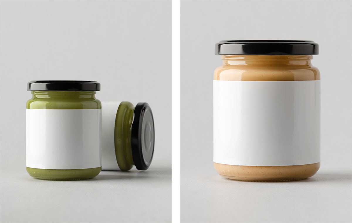
If you’re selling a physical product, choosing the right packaging is much simpler. Use a consistent set of brand colors that will make your product stand out on any shelf.
Remember, packaging needs to be intuitive and simple too and they can be a fun insight into your company’s personality. A good example is Sony’s Walkman earbuds displayed in a bottle of water to demonstrate its waterproof nature.
Be sure your packaging is:
- Clever and informative
- Compliant with industry standards
- Easy to produce and use
- Reflective of your brand personality
- Convenient for customers
Brand Colors
Color has an important emotional impact on us as human beings.
How would you feel in a room painted yellow compared to sitting in a room painted black? Certain colors can influence us on a deep, psychological level.
Many people agree that blue is a calming color that conveys trustworthiness and professionalism. Green evokes ideas of wealth and nature. Alternatively, red makes us think of passion, urgency, and even anger.
Signature colors can also factor massively into brand recognition. Studies show that having your own distinct color improves brand recognition by up to 80%. Just look at the iconic red of Coca-Cola.
Check your brand colors:
- Reflect your brand identity
- Create the right emotions in your audience
- Stay consistent to improve brand recognition
- Are unique to your product or service

Typography and Fonts
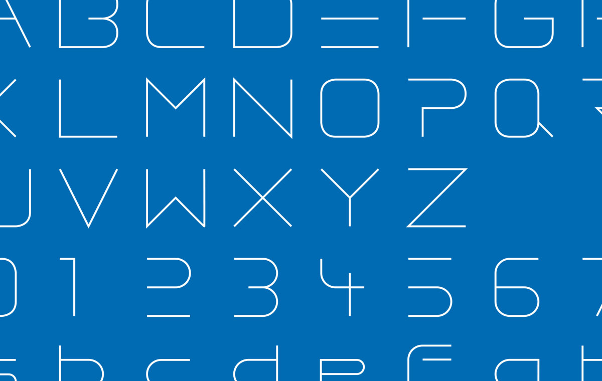
Font and typography are also elements of your brand’s visual identity.
Everyone knows the cursive typeface of the Coca-Cola brand, and the mystical style of the Harry Potter franchise logo. In some cases, your font will even play a part in your logo. Just look at companies like Google, Yahoo!, or even Disney!
You might have multiple fonts or typefaces in your brand portfolio. However, it’s important to keep things as simple as possible. Stick to a few basic fonts that you can use for everything.
In any environment, your fonts need to be clear and easy to read. A fancy cursive font might look great in a logo, but it won’t work well on product packaging.
Choose fonts that are:
- Legible and easy to read in any size
- Consistent with your brand image
- Aesthetically pleasing in your brand image
- Unique to your company

Photography and Image Guidelines
To have a consistent visual brand you don’t need to use the same image on every blog or email. However, all the images you use need a consistent look at feel.
Just look at all the brands on social media sites like Instagram today. They all have a specific “theme” that they follow when they’re posting content. The Sephora beauty brand focuses heavily on real people using beauty products in their images.
Whether you’re on social media, or just posting pictures on your blog, every image needs to coincide with your brand. This could mean you always use brightly-lit photos that feature people. It could even mean that you use a specific filter on all pictures.
Remember to:
- Make sure your images look professional, and well-done
- Avoid any stock photos or blurry images
- Stay consistent with your style
- Never use photos that don’t belong to you

Graphic Elements
Finally, graphic elements are the tiny details that add a finishing touch to your visual branding system. This might include the use of a certain amount of white space on your website. It could also mean that you always present your blogs and email messages in a certain way.
To develop a distinct and recognizable brand identity, sit down with your team and think about what kind of things are going to define your image. A professional graphic designer will be able to help with this. These professionals can pull together cohesive looks for your brand based on what they know about your company and its mission.
A graphical element style guide should provide information on everything from the sizes of the images that you use, to the way that you style buttons on your contact and landing pages. Remember:

Creating a Transformative Brand Identity
Your brand is more than just a logo or a handful of colors. However, in today’s visual world, the way that your company looks could make or break your chances of future opportunities.
With the right creative support, you can build a cohesive visual identity for your brand that helps customers to trust you. Just remember, as your business and marketplace changes, your brand identity may change with it.


